
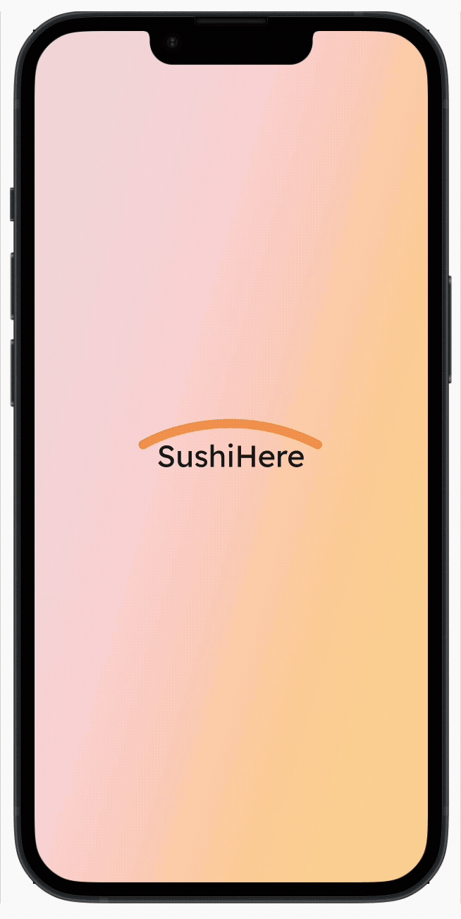
SushiHere
Sushi delivered safely and securely.Overview
SushiHere redefines sushi delivery by prioritizing secure transportation with real-time container movement tracking and accurate freshness estimation for raw food to cater concerned customers about sushi freshess and delivery.
︎ Go to Hi-Fi Prototype
SushiHere redefines sushi delivery by prioritizing secure transportation with real-time container movement tracking and accurate freshness estimation for raw food to cater concerned customers about sushi freshess and delivery.
︎ Go to Hi-Fi Prototype
Tool
Figma
Timeline
Jul-Jun 2024
Skills
User Research
UI Design
Journey Maps
Wireframes
Prototypes
Mobile App Design
WCAG Standards
Figma
Timeline
Jul-Jun 2024
Skills
User Research
UI Design
Journey Maps
Wireframes
Prototypes
Mobile App Design
WCAG Standards
User Research: Summary
I conducted in-depth interviews with four target groups—sushi enthusiasts, tech-savvy users, busy professionals, and local sushi lovers—to explore their behaviors, needs, preferences, and concerns when using an app for sushi delivery.
User Research: Pain Points
Transparency
No information about the exact status and location of sushi delivery in real-time
No information about the exact status and location of sushi delivery in real-time
Inaccuracy
Unreliable and inaccurate delivery tracking information
Unreliable and inaccurate delivery tracking information
Complexity
Complex interfaces of delivery tracking apps make it difficult to navigate
Complex interfaces of delivery tracking apps make it difficult to navigate
Food Safety
Concerns about the freshness and quality of sushi during the long delivery process
Concerns about the freshness and quality of sushi during the long delivery process
User Persona

Name: Emily Thompson
Age: 28
Occupation: Marketing manager
Hometown: New York City, New York
Sarah, a busy professional, relies on delivery services due to her tight schedule. She values accurate delivery updates and fresh, high-quality sushi.
Age: 28
Occupation: Marketing manager
Hometown: New York City, New York
Sarah, a busy professional, relies on delivery services due to her tight schedule. She values accurate delivery updates and fresh, high-quality sushi.
Goals
Frustrations
- Track sushi delivery in real-time.
- Get accurate updates and ETAs.
- Plan meals efficiently based on delivery status.
Frustrations
- No real-time status or location info.
- Inaccurate/delayed tracking.
- Poor sushi freshness due to delays.

Name: Tom Nguyuen
Age: 31
Occupation: Software Developer
Hometown: Los Angeles, California
Tom, a tech-savvy sushi enthusiast, enjoys exploring new apps. He values efficiency, simplicity, and a smooth user experience with real-time delivery updates.
Age: 31
Occupation: Software Developer
Hometown: Los Angeles, California
Tom, a tech-savvy sushi enthusiast, enjoys exploring new apps. He values efficiency, simplicity, and a smooth user experience with real-time delivery updates.
Goals
Frustrations
- Use a visually appealing, easy-to-navigate app.
- Get accurate real-time sushi delivery updates.
Frustrations
- Clunky, unattractive interfaces.
- Unreliable tracking information.
Problem Statements
Emily Thompson, a health-conscious individual with a busy schedule, needs a delivery app with real-time updates to ensure meal freshness and conveniently track the delivery process.
Tom Nguyen, a tech-savvy sushi lover, seeks a delivery app with a seamless user experience to easily plan his meal time based on accurate delivery estimates.
Current State Journey Map

Solution Statment
Our SushiHere app will allow users to track their sushi orders accurately in real time, ensuring transparency. It offers accurate delivery location updates, detects rough handling during transportation, and tracks the time elapsed since the sushi was prepared.User Flow

Paper Wireframes
I designed six wireframes to plan the layout and hierarchy of the first starting page and three more to map user interactions and overall app flow.


Digital Wireframes
Three key pages of the app were transformed into digital wireframes based on the paper wireframes. 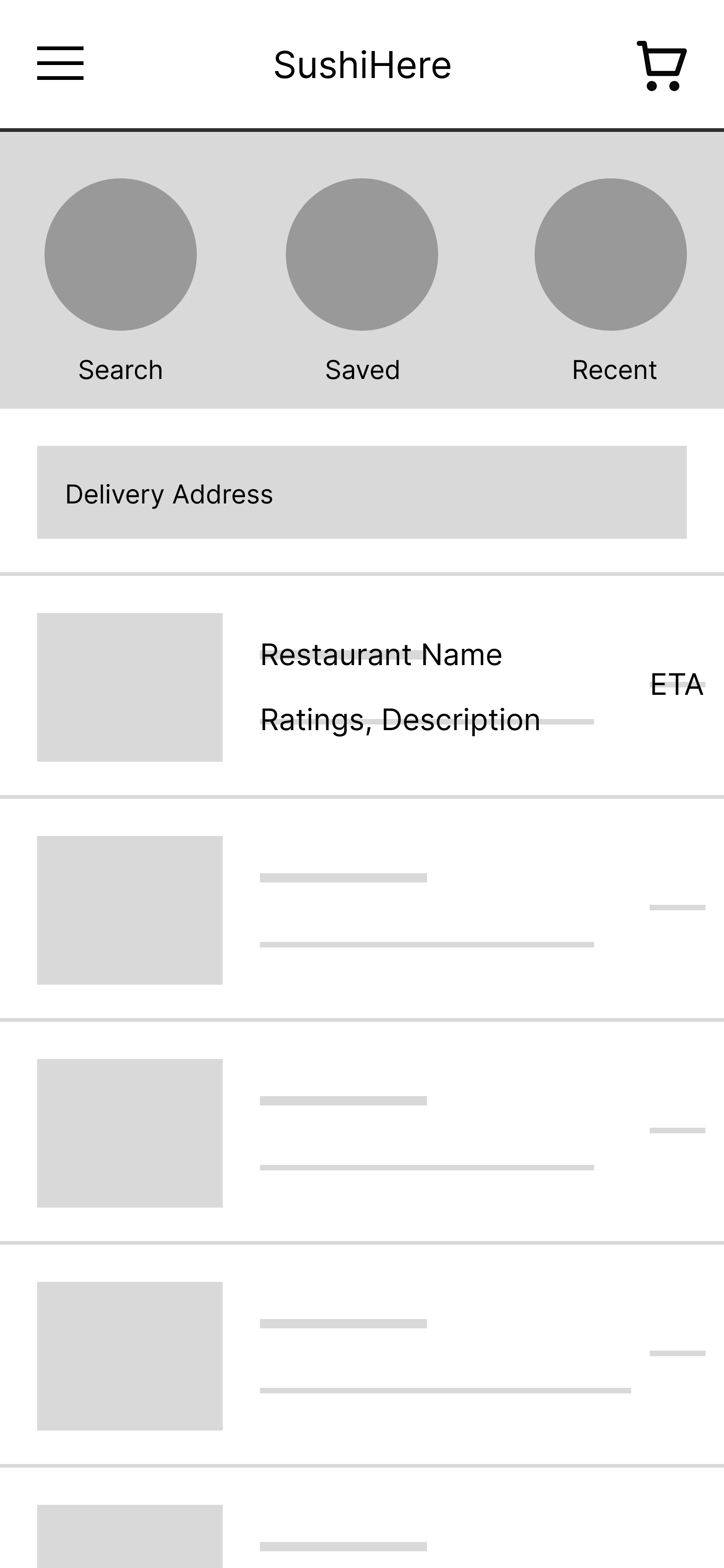


Style Guide
![]()

User testings
Usability Study: Findings
Unmoderated in-person testing was conducted with five participants who frequently use food delivery apps.Participants varied in age, gender, race, and ethnicity.
Round 1 Findings
-
Users appreciate the ability to reorder their previous orders quickly and easily.
-
Users expect to select a delivery address before they select a restaurant.
- Users want to read reviews to make informed dining choices.
Round 2 Findings
-
Users find the brown subtext confusing, mistaking it for equally important information.
-
Users prefer seeing a starting page with the app's logo instead of being immediately directed to the main page.
- Users need an explanation to understand the freshness standards for their sushi orders.
Refinement

Early designs only showed the ratings of the restaurant. After the usability studies, I added an additional option to read the reviews. I placed this review function right below the rating for easy navigation.

Early designs displayed options to choose a restaurant first and then select a delivery address which confused some users. Therefore, I relocated a delivery address above the options for an intuitive user experience.


Mockups
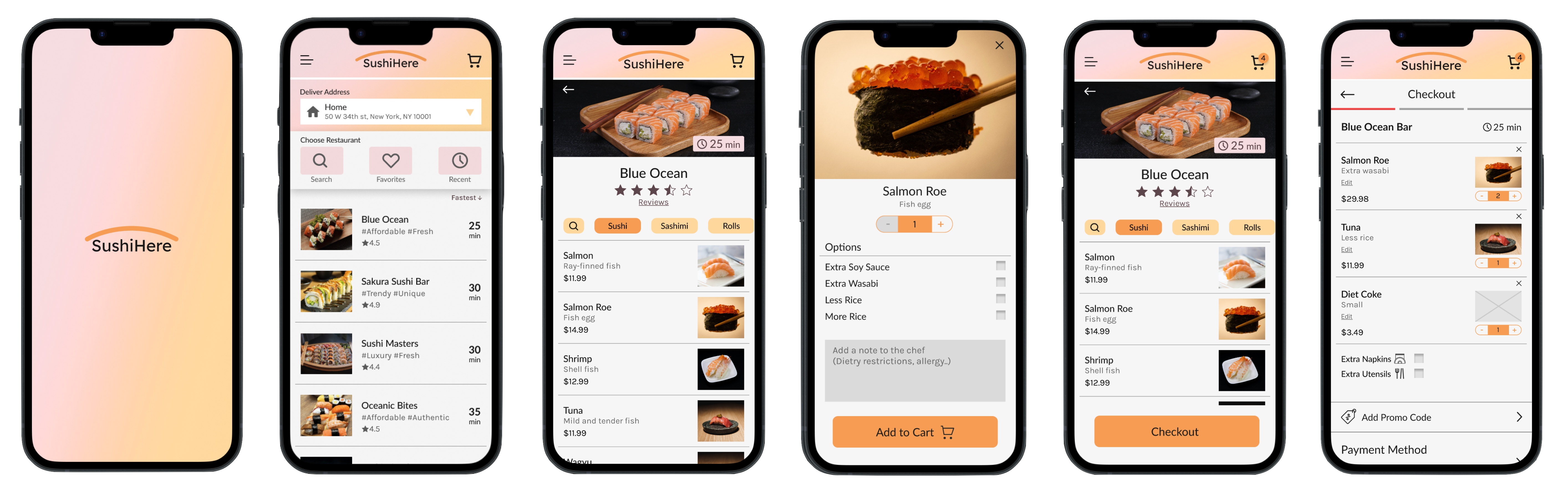
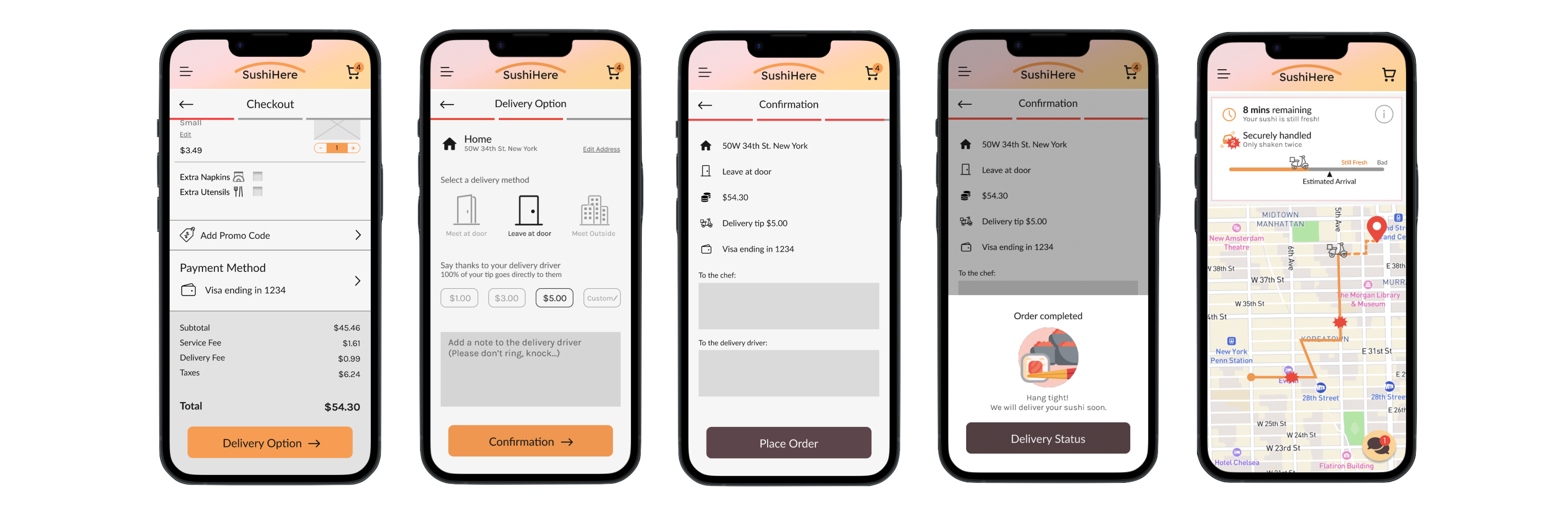
High Fidelity Designs
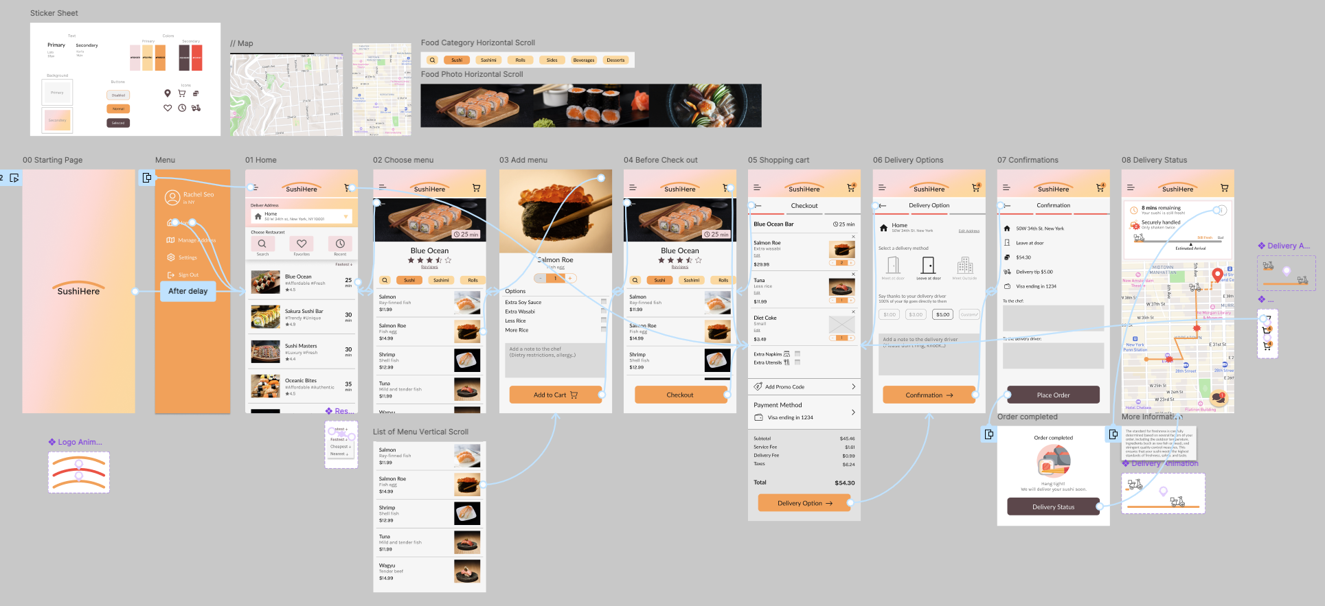
Prototype
Accessibility Considerations
Color Combinations
The selected color combinations meet accessibility standards, passing the WCAG test to ensure sufficient contrast between foreground and background elements.
The selected color combinations meet accessibility standards, passing the WCAG test to ensure sufficient contrast between foreground and background elements.
Clear and Concise Content
The app prioritizes clear, concise content to ensure information is easily understood by users with cognitive disabilities or reading difficulties.
The app prioritizes clear, concise content to ensure information is easily understood by users with cognitive disabilities or reading difficulties.
Use of Icons
To enhance accessibility, my designs incorporate clear and intuitive icons, ensuring that users can easily understand and interact.
To enhance accessibility, my designs incorporate clear and intuitive icons, ensuring that users can easily understand and interact.
Takeaways
Impact
The app focuses on meeting users' needs for fast delivery, accurate status updates, and high food quality.Peer feedback:
"I trust this app to deliver my food in good condition. I would definitely use it to order sushi."
What I Learned
I discovered that identifying user pain points and challenges is crucial for gaining valuable insights into app design tailored to their needs.I also recognized the importance of continuously gathering user feedback during development to guide design decisions and improve the overall user experience.