Boarding Pass Redesign
Redesigning with a focus on improving information hierarchy and typography.
Overview
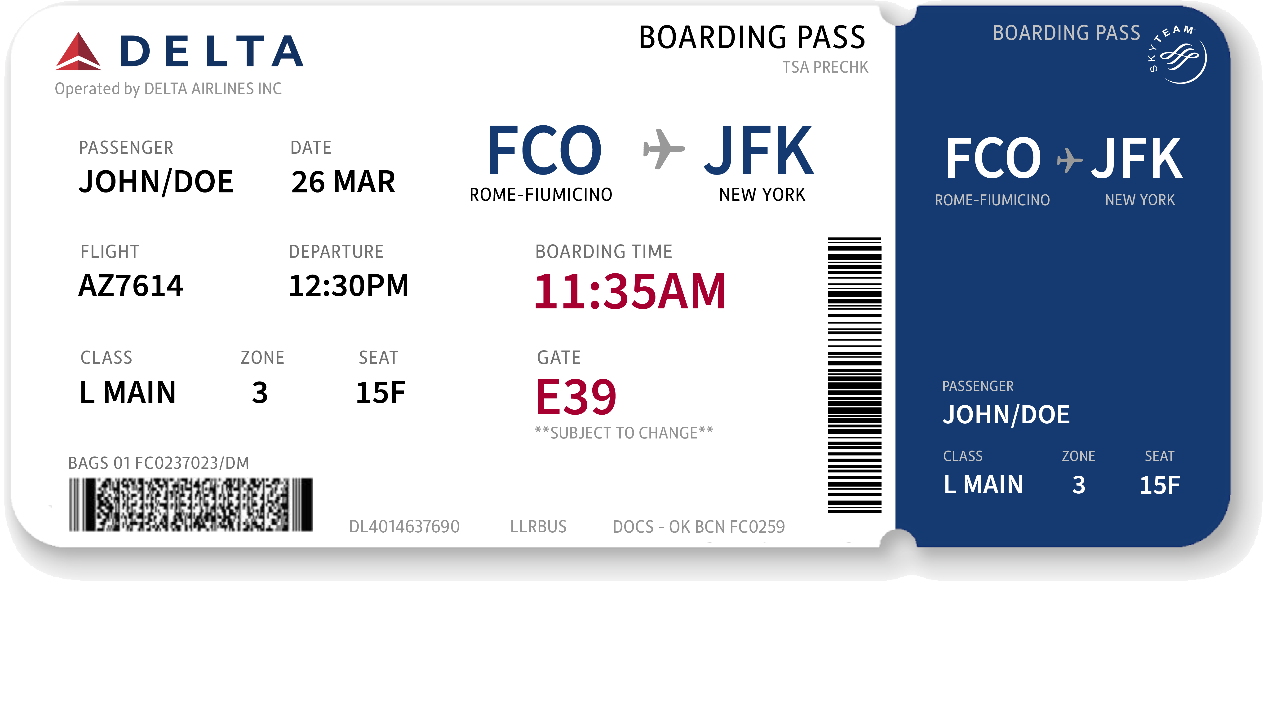
A redesigned Delta Airlines boarding pass aimed at enhancing user experience by improving information hierarchy, readability, and overall visual clarity through thoughtful typography and layout adjustments.
A redesigned Delta Airlines boarding pass aimed at enhancing user experience by improving information hierarchy, readability, and overall visual clarity through thoughtful typography and layout adjustments.
Tools
Adobe Illustrator
Timeline
June 2023
Adobe Illustrator
Timeline
June 2023
Identifying Problems

Final Outcome
I implemented a grid system to organize the text and introduced three colors—red and navy blue from the Delta logo, along with grey for subtext—to establish a clear sense of hierarchy.
